Freitag, 25. November 2016

Huggins meets Shattuck on velvety paper


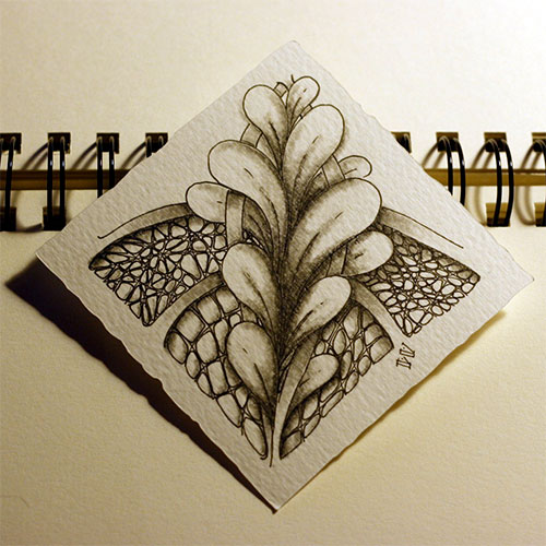
I finished the previous shown tile today. It was really really relaxing to shade it. I ignored my lightsource for the shading because its much easier to shade "Huggins" that way. I loved to do this whole tile and I love the result.

Used material:
- Staedtler pigment liner 0.1
- graphite pencil 2B (for the string)
- graphite pencil 3B (for shading)

on a self-cut Tile made of Fabriano Tiepolo paper (100% cotton)


PS.: That paper is great! I'm wondering why I didn't tried that paper before. It's smooth but feels a little bit velvety. It feels realy "premium" but it wasn't not more expensive then the other Papers I used before. (I bought this one as a big sheet of 50 cm x 70 cm and cutted the tiles myself). Next thing I will try is colored pencil on this paper or watercolor. maybe both... First I splash around with watercolor and while that dries I do something with my colored pencils!

Montag, 21. November 2016

I love this string

I finished reading the primer book but without doing every exercixe. I started one more tile with the istructions from the book but i didn't liked the flow... it was so restricted. I had to use this string and that tangle and *argh*
But nevertheless i liked reading that book and I will use some things I read! One tangle I rediscovered was "shattuck". This is a really easy one but I like it. Maybe I can use it as a border in my next tile. But I used it in this tile too. The other tangles are called Huggins, Zinger and Fedr.

Now I have to shade this tile, but I like it without shading too (and thats not too common for me xD).

PS.: maybe I do some more tiles with this string and combine them to one collage/mosaic, I think that could look good.

Freitag, 28. Oktober 2016

Diva Challenge #290

without shading
This week is the first time I participate at the challenge held by "The Diva" CZT on her blog.
This week we have to draw a tile with N'zeppel and Flux. Both patterns I'm comfortable with, so it isn't a real challenge to me, but it inspired me to draw this tile.
I used TanglePatterns string #213 as a guide and added some hollibough... so maybe that disqualifies me from the challenge. I dont know.

I like the finished tile very much. It looks free and flowing to me and not that much framed and restricted like the tile I did before (the one with printemps and crescent moon)

I drew this on a tile I made of 300g/m² watercolor-paper with Staedtler pigment liner 0.1 and 0.2. The shading is done with a faber castell 9000 pencil 3B and a tortillion.


Donnerstag, 27. Oktober 2016

Crescent Moon Tangleation

Because of the lesson described at the Primer-book I tried a tile with crescent moon and printemps only. Because I like Printemps but crescent moon isn't one of my favourites. I like to draw it but not its look. So I tried to change it a bit to be more pleasant to my eyes.

It isn't shaded yet, and I'm not sure that I will shade it at all.
But I think I will try this crescent moon/printemps combination again on an other tile.

Zentangle Primer Vol. 01

my Zentangle Primer Vol. 01
Recently I bought a new book, the german translated version of "Zentangle Primer vol. 01" by Rick Roberts and Maria Thomas.

I saw the original book on many english websites to buy from a CZT, but because these are mostly based in the USA it was really expensive to buy for me. Not the book itself, but the shipping costs. And so I ended with looking at the beautiful cover without buying that book.
But now I'm really happy that it was translated to german and I could buy this version easily on amazon. (Thanks to YvonneLi. from A Tangle of Lines who recomended that book! Because without that I woul have missed that there is a german version).

I haven't read the whole book yet, because its more a step by step tutorial and I want to do the lessons described in this book. But I already did the first lesson and because of that I'm a bit more motivated zo draw some zentangles again.
The tangles described in lesson one are crescent moon, hollibaugh, printemps and florz. All these tangles I already tried so they weren't new but never the less I started with them again. And I have to say: I didn't like the tiles I drew with them, so I wont show them to you. But I do like that I started with zentangle again!

I like this book really much. The paper is smooth and a bit glossy and not that thin. It's cover is a lose one, but one difference to the original english version is that its not bound in linen, but it has a linen structure printed on.

Freitag, 3. Juni 2016

All that glitters is not gold


Same on my newest tile. It looks like gold, maybe it glitters a bit too much, but its ink. I used Winsor &Newton Gold-Metallic Bronze Ink and a tiny paintbrush to color the orbs. First I wanted to color them with colored pencils and shade them like gemstones, but I didn't like the test orbs on a seperate piece of paper.

I bought the gold ink weeks (months?) ago and wanted to do a tile with it since then... The tangle pattern I used was really simple. Its called "Lollywimple" and I combined it with one of my alltime favourites: "Flux"

I hope you like it :)


I dont have a "without shadow" picture this time, because I started this tile at school and did most of shading there too. I'm sorry. Maybe next time!

Dienstag, 24. Mai 2016

Revised IX

Hello guys,

I revised my previously shown IX tile a bit. Eni Oken (CZT) pointed out that IX could be seen more 3D, a bit like pyramids. Before she told that I saw them only flat, like flower petals, but I think she's right. IX could be pyramids and I shadet the pattern like that.

I wanted to show you the result because I think its surprisingly how diffrent a tile can look with different shading.

Montag, 23. Mai 2016

IX and pencil zengems

Hey guys :D

Today I shaded the tile I showed previously. The one with the diamond shapes, IX and Tipple. I love Tipple as a filler; it is easy to draw and relaxing but looks good on tiles. You can fill any shape or
"throw" it on the tile without planning, but it still looks good.

This tile I drew without a string. I started with the bigger gem/ix and then did the smaller one. Tipple was drawn last, because the tile looked empty without a filler pattern. I thought about flux (I love flux as much as tipple) but I thought flux would be to organic for this tile.

This time I used my own tiles. I cut them from "Lana Dessin 220" drawing paper. Its not as sturdy as the Peter Pauper Press Artist Tiles but I like its creamy color.

I have to admit that I really like the silver gemstones. It was my first try with gems without color, only with pencil but I think the result is presentable.


In school this morning I started a new tile. Yeah I know I'm not at school to draw, but to learn. But there is only one month left until I have to do an oral examination to finish my apprenticeship. So we talk much but write less and I can listen/talk and draw! And sometimes I need to keep my fingers busy.
This time I wanted to try the new weekly challenge of "Shading Zentangle" - it's "Skye" deconstructed by Margaret Bremner. I think this tangle its not that easy to draw and need much concentration to draw it right. This tile isn't done yet. I would like to add some more tangles, but I'm not sure which to chose. But maybe if I sleep over I will get some inspiration.

Samstag, 21. Mai 2016

IX...

... a Square One: Purely Zentangle Challenge.

I love the weekle challenges hosted by the facebook group mentioned above. This one we have to draw "IX" a official Zentangle pattern I never drew before. So I wanted to test this pattern on a tile. I haven't shaded the tile yet but I wanted to show you my preliminary result.

I think this pattern isn't difficult to draw but finished it looks really complex. I like it. I will shade the diamond shapes like gems (but only with pencil to meet the group-requirements.

Maybe I will draw some more Tiles with IX because its fun :D

Montag, 16. Mai 2016

Tetris...


... or Zentangle?

collecting and testing ideas to Batumber
Some days ago I found string #209 on tanglepatterns.com and it reminded me of Tetris the (very old) Gameboy game. I loved Tetris, so I had to create a tile with that string, but I didn't want to copy it 1:1 so I changed the string a bit.

But before I started drawing on my tile I tested the tangle I wanted to draw. I knew I wanted to draw some "Batumber" and combine it with some other patterns but in the end I drew a monotangle because Batumber is really convertible.


3,5" tile without shadows

After I tested Batumber in many different styles and forms I started to draw my tile. I used a ruler for the pencil grid but drew the "tetris-blocks" freehand over that grid.

Sometimes I thought I need a magnifier because the pattern on the bottom left and upper right are really really small and it was difficult to fill the little black spaces. And shading these tiny leafs was difficult too.
But I'm sure I will use Batumber again. I love that tangle <3


Material I used: 
  • Peter Pauper Press Artist's Tile Set
  • Staedtler pigment liner 0.05 / 0.01 / 0.02
  • Faber Castell 9000 Pencil H // 3B
  • Cretacolor paper stump
  • Dr. Ph. Martin's Pen White for highlights

finished Tile