Freitag, 25. November 2016

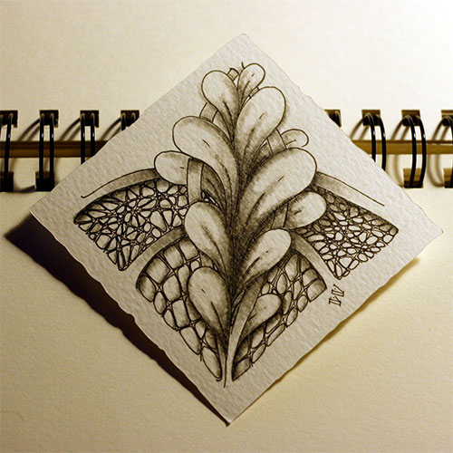
Huggins meets Shattuck on velvety paper


I finished the previous shown tile today. It was really really relaxing to shade it. I ignored my lightsource for the shading because its much easier to shade "Huggins" that way. I loved to do this whole tile and I love the result.

Used material:
- Staedtler pigment liner 0.1
- graphite pencil 2B (for the string)
- graphite pencil 3B (for shading)

on a self-cut Tile made of Fabriano Tiepolo paper (100% cotton)


PS.: That paper is great! I'm wondering why I didn't tried that paper before. It's smooth but feels a little bit velvety. It feels realy "premium" but it wasn't not more expensive then the other Papers I used before. (I bought this one as a big sheet of 50 cm x 70 cm and cutted the tiles myself). Next thing I will try is colored pencil on this paper or watercolor. maybe both... First I splash around with watercolor and while that dries I do something with my colored pencils!

Montag, 21. November 2016

I love this string

I finished reading the primer book but without doing every exercixe. I started one more tile with the istructions from the book but i didn't liked the flow... it was so restricted. I had to use this string and that tangle and *argh*
But nevertheless i liked reading that book and I will use some things I read! One tangle I rediscovered was "shattuck". This is a really easy one but I like it. Maybe I can use it as a border in my next tile. But I used it in this tile too. The other tangles are called Huggins, Zinger and Fedr.

Now I have to shade this tile, but I like it without shading too (and thats not too common for me xD).

PS.: maybe I do some more tiles with this string and combine them to one collage/mosaic, I think that could look good.

Freitag, 28. Oktober 2016

Diva Challenge #290

without shading
This week is the first time I participate at the challenge held by "The Diva" CZT on her blog.
This week we have to draw a tile with N'zeppel and Flux. Both patterns I'm comfortable with, so it isn't a real challenge to me, but it inspired me to draw this tile.
I used TanglePatterns string #213 as a guide and added some hollibough... so maybe that disqualifies me from the challenge. I dont know.

I like the finished tile very much. It looks free and flowing to me and not that much framed and restricted like the tile I did before (the one with printemps and crescent moon)

I drew this on a tile I made of 300g/m² watercolor-paper with Staedtler pigment liner 0.1 and 0.2. The shading is done with a faber castell 9000 pencil 3B and a tortillion.


Donnerstag, 27. Oktober 2016

Crescent Moon Tangleation

Because of the lesson described at the Primer-book I tried a tile with crescent moon and printemps only. Because I like Printemps but crescent moon isn't one of my favourites. I like to draw it but not its look. So I tried to change it a bit to be more pleasant to my eyes.

It isn't shaded yet, and I'm not sure that I will shade it at all.
But I think I will try this crescent moon/printemps combination again on an other tile.

Zentangle Primer Vol. 01

my Zentangle Primer Vol. 01
Recently I bought a new book, the german translated version of "Zentangle Primer vol. 01" by Rick Roberts and Maria Thomas.

I saw the original book on many english websites to buy from a CZT, but because these are mostly based in the USA it was really expensive to buy for me. Not the book itself, but the shipping costs. And so I ended with looking at the beautiful cover without buying that book.
But now I'm really happy that it was translated to german and I could buy this version easily on amazon. (Thanks to YvonneLi. from A Tangle of Lines who recomended that book! Because without that I woul have missed that there is a german version).

I haven't read the whole book yet, because its more a step by step tutorial and I want to do the lessons described in this book. But I already did the first lesson and because of that I'm a bit more motivated zo draw some zentangles again.
The tangles described in lesson one are crescent moon, hollibaugh, printemps and florz. All these tangles I already tried so they weren't new but never the less I started with them again. And I have to say: I didn't like the tiles I drew with them, so I wont show them to you. But I do like that I started with zentangle again!

I like this book really much. The paper is smooth and a bit glossy and not that thin. It's cover is a lose one, but one difference to the original english version is that its not bound in linen, but it has a linen structure printed on.

Freitag, 3. Juni 2016

All that glitters is not gold


Same on my newest tile. It looks like gold, maybe it glitters a bit too much, but its ink. I used Winsor &Newton Gold-Metallic Bronze Ink and a tiny paintbrush to color the orbs. First I wanted to color them with colored pencils and shade them like gemstones, but I didn't like the test orbs on a seperate piece of paper.

I bought the gold ink weeks (months?) ago and wanted to do a tile with it since then... The tangle pattern I used was really simple. Its called "Lollywimple" and I combined it with one of my alltime favourites: "Flux"

I hope you like it :)


I dont have a "without shadow" picture this time, because I started this tile at school and did most of shading there too. I'm sorry. Maybe next time!

Dienstag, 24. Mai 2016

Revised IX

Hello guys,

I revised my previously shown IX tile a bit. Eni Oken (CZT) pointed out that IX could be seen more 3D, a bit like pyramids. Before she told that I saw them only flat, like flower petals, but I think she's right. IX could be pyramids and I shadet the pattern like that.

I wanted to show you the result because I think its surprisingly how diffrent a tile can look with different shading.